
As in the moments following the 2016 US election, win probabilities took center stage in public discourse after New England’s comeback victory in the Super Bowl over Atlanta.
Unfortunately, not everyone was enamored.
While it’s tempting to deride conclusions like Pete’s, it’s also too easy of a way out. And, to be honest, I share a small piece of his frustration, because there’s a lingering secret behind win probability models:
Essentially, they’re all wrong.
But win probabilities models can still be useful.
To examine more deeply, I’ll compare 6 independently created win probability models using projections from Super Bowl 51. Lessons learned can help us better understand how these models operate. Additionally, I’ll provide one example of how to check a win probability model’s accuracy, and share some guidelines for how we should better disseminate win probability information.
So, what is a win probability?
A win probability is the likelihood that, given any time-state in the game, a certain team will win the game.
Win probabilities can be both subjective (“This game feels like a toss-up”) or objective (“My statistical model gives the Falcons a 50% chance of winning”). This post focuses on the latter type, which have become increasingly popular across sports over the last decade.
What are some NFL win probability models?
Here are the models that I’ll compare in this post.
Pro Football Reference (PFR): Stemming from research by Wayne Winston and Hal Stern, PFR’s model uses the normal approximation and expected points to quantify team chances of winning. Read more in Neil Paine’s post here.
ESPN: ESPN’s predictions, provided by Henry Gargiulo and Brian Burke, are derived from an ensemble of machine learning models.
PhD Football: An open-sourced creation of Andrew Schechtman-Rook built using Python, this model uses logistic regression to predict game outcomes.
nflscrapR: An R package from graduate students at Carnegie Mellon, win probabilities stem from a generalized additive model of game outcomes.
Lock and Nettleton: Probabilities generated via a random forest, as done by Dennis Lock and Dan Nettleton in the Journal of Quantitative Analysis in Sports, implemented with data from Armchair Analysis.
Gambletron: Created by Todd Schneider, Gambletron uses real time betting market data to impute probabilities.
Before we start, a particular thanks to PFR for this and all of their public work, Brian and Hank, Andrew, Ron and Maksim, and a student of mine (Derrick) for their help in either sharing or pulling in the data. I greatly appreciate their work and/or willingness to share. Sadly, not everyone was so helpful.* Additionally, note that the 6 models used 6 unique approaches, which demonstrate the variety of ways that people have thought about win probability.
Finally, R code – and predictions from a few models – are up on my Github page.
How’d probabilities look in the Super Bowl?
One interesting way to start is to visualize how each model viewed the Super Bowl. Here’s a chart of New England’s play-by-play win probabilities, using a different color for each set of predictions.**
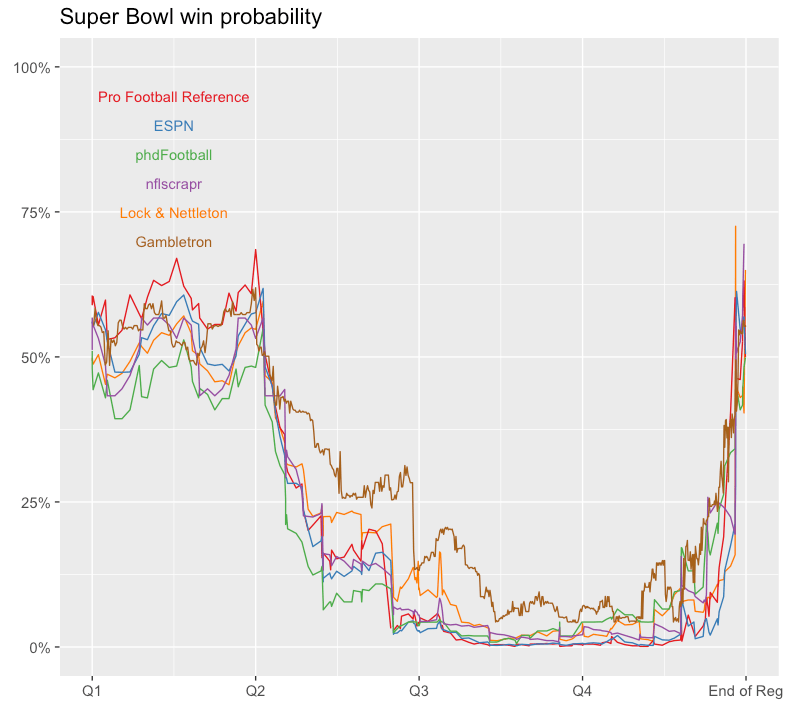
Super Bowl win probabilities (New England’s).
For most of the game, there’s at least a 5% gap between New England’s lowest and highest projections, and at several points, the gap is as high as 10%.
With six unique models, it’s not surprising to see these differences, but I’d also argue that this type of variation is not an attractive property for disseminating win probability information.
How big of a comeback was it?
It’s obvious that by the third quarter, New England’s chances were slim. Of course, with probabilities clustered near zero, it’s a bit difficult to precisely identify differences between the models in the initial chart. So, I converted the probabilities to odds to get a better sense of how the models viewed New England’s comeback.
Here’s that chart, and I added dotted lines to identify the point in the game when each model gave New England its longest odds of a comeback.
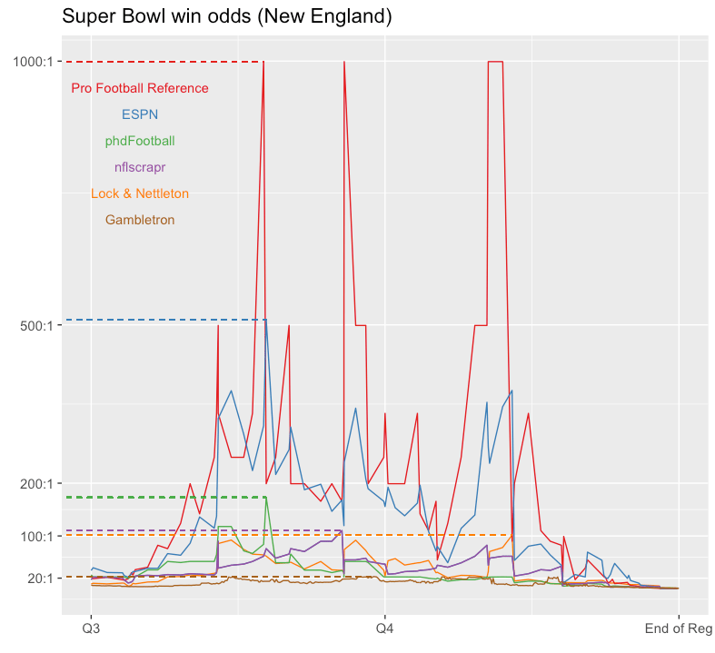
Odds of winning Super Bowl 51, relative to New England. Second half only shown.
Here, gaps between models are more substantial, which is not surprising given that odds are not robust to small changes for probabilities near 0. At multiple points, PFR gave New England about a 1 in 1000 chance of winning (1000:1 odds) while projections from Gambletron (which is arguably serving a different purpose with its numbers) barely crossed 25:1.
Thus, the wow-factor of the Patriots comeback depends on your source. If you choose Gambletron, it’s a one Super Bowl every two or three decades type of comeback. If you choose PFR’s, it’s a Super Bowl comeback we’ll only see once every millennium. From a communication perspective, this is a weakness to win probability models, and one that shows up frequently given that, for better or worse, people most often look at win probability charts after a major comeback.
Finally, it’s worth noting that the moments in the game when New England was given the longest odds of winning also differ, varying from midway through the third quarter to midway through the fourth. Indeed, your definition of how much of a comeback it was isn’t just limited by your choice of a model, but by your identification of which time in the game to start at, too.
How about win probability added?
Brian Burke makes an important point on the Ringer that win probability models are perhaps best used for understanding in-game decision making. Often, this is done by comparing win probability from from one play to the next using a metric called win probability added (WPA).
In the Super Bowl, leaps or drops in New England’s WPA are also somewhat dependent on model choice. As an example, New England’s second play from scrimmage, a 9 yard completion on 2nd-10 from Tom Brady to Julian Edelman, helped the Patriots according to PhD Football (+3%) but hurt the Patriots according to nflscrapR (-2%).
Here’s a chart that compares each pair of models’ WPA.***
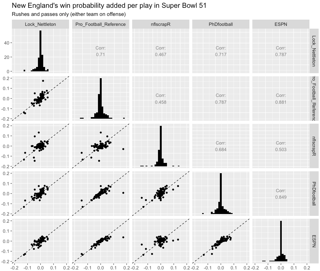
Win probability added, contrasted between 5 NFL win probability models in Super Bowl 51.
The figures in the bottom left show pairwise scatter plots between each models’ WPA, with correlations listed in the top right. Histograms of WPA (relative to New England) are shown on the diagonal.
There’s a moderately strong link in WPA between each pair of predictions; the strongest correlation coefficient is with ESPN and PhD Football (0.85), with the weakest between PFR and nflscrapR (0.45).
However, there’s still a decent amount of variability with respect to how each model sees the helpfulness of each play. For example, of the 125 plays shown, on fewer than half (57, or 46%) did all five models agree that the outcome either helped or hurt the Patriots. This is another humbling aspect of win probability models — there’s both uncertainty in team chances at any one point in time, but also from one play to the next.
So how can we know if a model is useful?
Let’s take a break for a fun anecdote.
The typical NFL season has about 40,000 plays. Let’s imagine that you flip a fair coin 40,000 times to find the proportion of heads. We know the true probability of heads — it’s 50% — but if we use the results from our 40,000 flips, the average distance we can expect between our estimate of heads and the truth is about 0.2%. That is, we can’t predict a fair coin much better than +/- 0.2% in 40,000 trials. And if we can’t get precise probability estimates from coin tosses — which don’t have variables like the offensive team, defensive team, score, down, distance, spread, clock time, and timeouts attached to them — how can we expect our NFL win probabilities to be any more accurate?
So, whether or not a win probability at a certain time in is off by 10% or 0.2%, it’s off. Humbly, it’s why all models are wrong.
So how can we know if a model is useful?
Well, the best way to judge projections of any outcome is use events that are yet to take place. For football games, this correlates to using past games (termed training data) to derive predictions for future games (test data). If the probabilities are reasonable, those predictions should match future game outcomes.
So, that’s what I did using Lock and Nettleton’s random forest model. I stated by using the 2005-2015 seasons as training data. Next, I sampled 5 plays in each quarter in each game from the 2016 season to use as test data (5340 total). Sampling plays in this manner will ensure that I have the same number of plays from each game (to weigh games equally) and that I haven’t overfit (there are no overlapping plays in the test and training data). It’s also how the Super Bowl projections above were made.
Here’s a chart of how well the Lock & Nettleton model predictions did in 2016, aggregated by quarter. I included points that average offensive team probabilities to the nearest 0.05, as well as the corresponding fraction of games in that bin when the offensive team won. The closer projections are to the diagonal line, the better. If you want to see the R code for this chart (and the ones above), see my Github page.

Observed versus estimated win probability for a sample of 2016 NFL plays. Predictions derived from Lock and Nettleton’s random forest model. By and large, projections match reality, as demonstrated by the line of best fit roughly corresponding to the line y = x.
In Lock and Nettleton’s model, results are fairly reasonable. Across most bins in most quarters, probabilities reflect reality. It’s not that projections are perfect – teams with low win probabilities in the first quarter win more often than expected, for example – but it’s difficult to identify any precise location where the model is off by more than what we’d expect due to chance alone. Third quarter probabilities, as an example, look particularly reasonable. I’d also argue that this model’s performance is more impressive given that no games from 2016 were used in its evaluation, which may have helped the model more reasonably pick up on recent changes to the game.
Charts like the above don’t ensure that our probabilities are correct, as that’s impossible. Instead, they are there to provide warning signs if, for certain types of game situations, probabilities were off.****
Practical recommendations
Given the above, here is a set of recommendations for those of us creating or citing win probabilities.
- Avoid over-precision. Using too many digits (e.g., 60.51%) belies the true difficulty of predicting unrealized outcomes in sports. Cap probabilities to the nearest percentage. (Excellent example: 538).
- Embrace uncertainty. Instead of “There’s a 2% chance”, use “There’s about a 2% chance” or “About 1 in 50.”
- Take extra care when presenting surprising results. It’s difficult to believe that New England’s comeback was a once a millennium type of result, but it was often presented as such.
- Model check, and share results. This is an easy thing to do, and it’s the only way to know if predictions are close to accurate.
- Update models over time. Sports leagues are ever-evolving — as examples, NBA teams shoot more 3’s and NFL teams pass often than ever before — and so if a model isn’t updated over time, predictions could go from wrong to really wrong.
***************************
*I also emailed numberFire and asked for their projections. The response was as follows:
Unfortunately we will not be able to share with you our predictive model. However you can review the perks from our premium services to see how it all works and what we have to offer. If you have any further questions do not hesitate to reach out to us.
That’s bullshit. The chart’s literally right here, with the probabilities shown when hovering over. Those probabilities are shown to four decimal places.
**I dropped overtime plays. There’s enough extrapolation in win probabilities as it is, and extending to rarely played overtime events seems unwise. Additionally, note that there may not be perfect alignment in the charts with respect to Gambletron’s data, which works by real time (and not clock time).
***This chart only shows runs and passes, as there were too many irregularities in how each model ordered and timed special teams plays. Gambletron is not shown given that its’ time stamps reflect real time, and not clock time.
*****One of my goals this summer will be to make Lock & Nettleton’s model more public, but I’ll need to check with the authors, first. It’s a fairly reasonable model to fit in R, and it would be great to have an NFL win probability Shiny app where those unfamiliar with R could enter in constants to get probabilities.
Note: An earlier version of this post pointed to possible limitations of PFR’s win probability model. However, after some offseason tuning, things appear to be more readily in order.

Reblogged this on Stats in the Wild and commented:
How does Matt Ryan sleep at night?
Hey Lopez, I have one comment that I think is crucial with these models. All the fancy models in the world are only as appropriate as the loss function that they are optimized for. I think a crucial part of this discussion is what is the loss function? Accuracy? Hinge Loss? Log Loss? If it’s accuracy, the penalty for a .55 prediction is the same for a .99 prediction when there is a 0 so clearly when predicting probabilities accuracy is not appropriate. Log loss seems to me the most appropriate and when I see really confident win-probability models I struggle to believe they are optimized for Log Loss since if they were, they would be far less confident. Nice writeup, thanks for posting.
Totally agree Adam, and that’s a point I should have raised that point somewhere.
L & N’s model showed a decent performance as far as 2016 calibration, but it wasn’t trained on log-loss… instead using MSE.
The ones most commonly cited models (PFR, ESPN) are too black-box at this point, and that’s particularly frustrating from my perspective.