
In a recent paper, Gregory Matthews, Ben Baumer, and I looked at the role of randomness in professional sports outcomes. Perhaps unsurprisingly, we identified that NHL and MLB games tend to be closest to a coin flip, with the worst teams capable of beating the best. Meanwhile, there are larger gaps in talent between franchises in each of the NBA and NFL. Although our focus was on individual game outcomes, we laid a bit of groundwork for related work with respect to between-league and between-team comparisons.
In particular, I left curious as to the end impact of the NHL’s randomness. If most game outcomes are near coin flips, what impact does that have on season outcomes? In this post, I’ll reflect back on the NHL’s final standings, with the goal of better understanding the underlying differences in team strengths, and what that means about where teams finish.
Why final standings?
Sports leagues use final regular season standings to both determine playoff eligibility and provide a rough sense of where other teams will pick in future player drafts. Indeed, there’s no simpler mechanism by which we judge a team’s regular season success than by where it finished in the standings. So when the Washington Capitals finish the season with 118 points, we are left to assume that the Capitals are a 118 point team.
However, standings are function of several hard-to-define inputs, including team talent, schedule difficulty, timing, injuries, and, of course, luck. And so while the Capitals finished with 118 points, it’d also be exceedingly unlikely for the Capitals to finish on that exact 118 number if we were to somehow replay the regular season again under an identical set of circumstances.
But how many points could that 118-point Capitals team finish with? And what meaningful differences between teams can we extract from where they finish in the standings?
Resampling a season
Even though the NHL only plays each season one time, it doesn’t mean that we also face the same restriction. Indeed, perhaps the only way to revisit differences in league standings that could have been observed would be to replay games. If we can assume that the probability of each game’s outcome is known — admittedly, an unjustifiable assumption — then the resampling of each season is quite straightforward. Given each game’s probability, we can simulate each regular season contest, impute the corresponding final standings, and repeat this process several times.
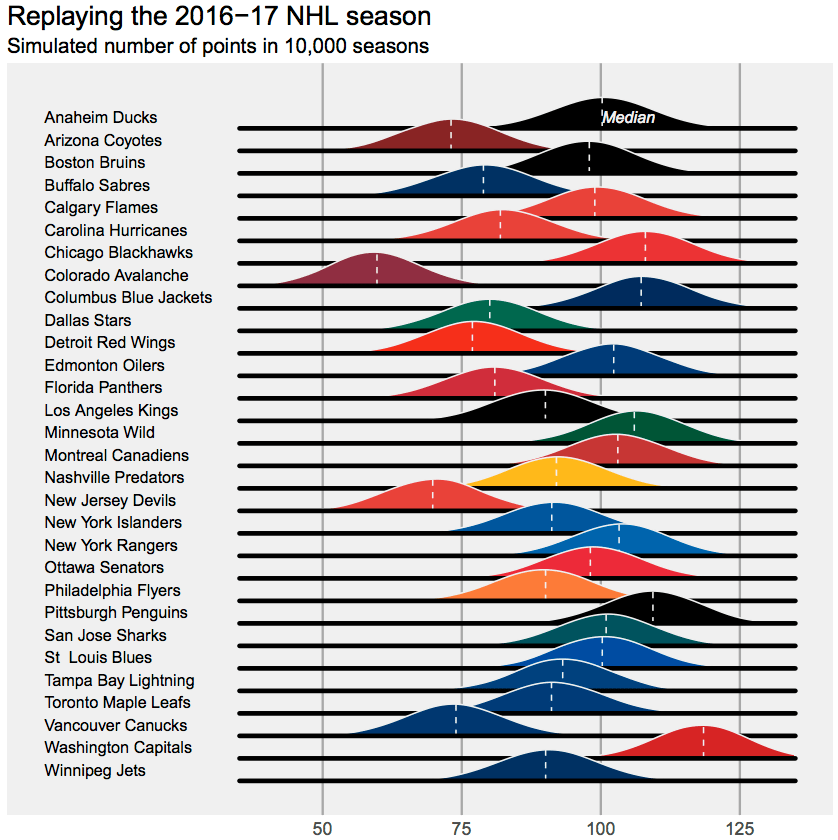
Here’s what the 2016-17 NHL season would look like when replayed 1000 times (assumptions are provided at the end). The chart below shows imputed point totals for each team, provided in overlaid, Joy Division inspired density plots.
What do we learn?
To start, that 118-point Capitals team could have easily been a 118-point Capitals team or a 128-point Capitals team. In fact, for all teams, swings of 10 points in either direction are not that surprising. For the Capitals, those 10 points could be the difference between being the top-seed in the Metro Division and finishing as the third seed. For several other franchises, 10 points is the difference between making the playoffs and staying home.
Additionally, while the standings tell us that the Capitals were the league’s best team in 2016-17, there’s enough overlap between Washington and several other teams, including Chicago, Minnesota, Pittsburgh, and even Montreal, that it’s insufficient to use standings alone to justify arguing that Washington is the best team. Given the standings and the format of the league’s schedule, we know that the Caps were better than Vancouver and that they were probably better than Toronto. However, we’d hardly have any idea if they were better than Chicago when looking at the standings alone.
Postscripts
Here are the assumptions I used to replay the 16-17 NHL season.
-Team strengths were estimated using a Bradley Terry model with a fixed home advantage. While this posits that wins alone are the best way to analyze hockey teams, I’m okay with that for this exercise, as it means that our imputed standings will roughly be centered around this year’s observed standings. Game-level probabilities were extracted using each team’s estimated team strength, while providing a fixed advantage to the home team.
-If anything, I’m likely underestimating the amount of randomness in league standings. In estimating probabilities, I assumed that team strengths, as estimated using the Bradley-Terry model, were known. Of course, that’s not the case, and a more detailed imputation would account for the uncertainty in these parameter estimates.
-I assumed that overtime outcomes are random, with OT occurring in 24% of games. This rate matches the fraction of 16-17 contests that have gone to OT. Note that OT outcomes are not entirely random (see here), but they are probably close enough for our purposes here. Recall that the NHL’s scoring system awards a point to the overtime loser, so this is our way of accounting for that.
-Stay tuned for a future post, in which I’ll look at the role of the NHL’s unbalanced schedule in determining final standings. I’ll also share the code at that point.

Reblogged this on Stats in the Wild and commented:
This is interesting.
I really liked the visual display of 1000 seasons with a normal distribution for each team in a single chart. Can you say which program you used to display would also be interesting to know the frequency of probability of a team crossing the Magic playoff number of say 93 points.
Thanks for the post
Sure thing – it’s in R, and I’ll post the code later this week (I’m writing a follow up post). Like your idea of playoff chances – but I’d probably want more accurate probabilities than the ones I used in this chart. Thanks for reading!