
The last year or so has sprung a few interesting articles that point to both travel and back-to-back contests as taking a toll on team performance in the NBA.
This increased awareness has led to an exorbitant number of players being rested by their teams, as shown in Baxter’s tweet below.
With several star players now spending a few games a year on the bench, this begs the question: Is the NBA’s regular season too long?
Relative to the NHL, NFL, and MLB, the answer is a resounding yes.
**********************
There is no obvious mechanism for finding an ideal schedule length or for comparing the schedule lengths of different sports. In one notable example from 2007, Phil and some commenters used standard deviations of team win percentages in an informal back and forth to suggest that 33 NBA games was the rough equivalent of 162 baseball games. That conversation grew out of a few economics papers, which linked schedule length to issues of competitive balance.*
Ultimately – and putting business considerations aside – a season is too long if adding more games does little to distinguish measurements of team strength. Of course, if those additional games were to change our perceptions of team ability, then one could argue that a season was too short.
Generally, team strength can be looked at by using won-loss percentage as a proxy.** And so one simplified approach to looking at season length would compare a team’s performance at any given point in a season to their win percentage at season’s end. So that’s exactly what I did, using data from the four North American professional sporting leagues.
The chart below shows the R-squared value comparing league-wide won-loss percentages at each point in a season to eventual won-loss percentages at season’s end.*** I used the last decade of data, excluding the current NFL season and the NBA/NHL lockout years.
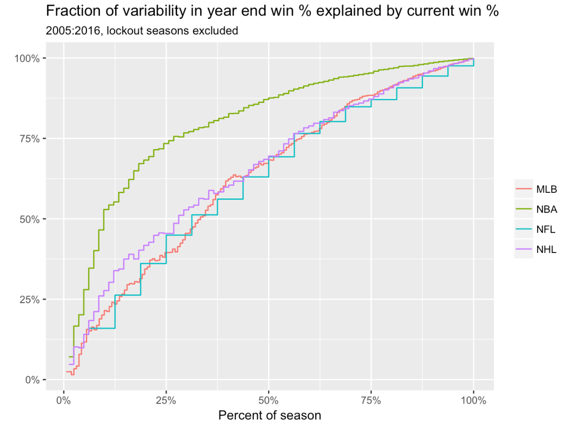
Instead of using game-number on the x-axis (which would vary by sport), I used percent of the season. For example, the 50% percent mark corresponds to 8, 41, 41, and 81 games for each team in the NFL, NBA, NHL, and MLB, respectively. The slow convergence to 1 is expected, as a team’s win percentage will more closely correspond to its final win percentage as the season progresses.
In any case, the graph identifies similarities in the NHL, NFL, and MLB. For each league, across most points in the season (based on percentage of the season played), there is a decent amount of similarity between how teams compare to their eventual year-long performance. One benefit of R-squared is that it’s interpretable, and above it reflects the fraction of variability in year-end win percentage explained by win percentage at each point prior. As an example, roughly 75% of season-long win percentage can be explained through the first 55% of the season in the NFL, NHL, and MLB.
The NBA curve, meanwhile, stands out, rising quickly above the other leagues. We hit that 75% mark in explaining season-long win percentage by about the 25% mark on the x-axis for example, reflecting about 20 games played. As a reference point, we’ve already passed that point in the 2016-17 season. Alternatively, within just a dozen or so games, we can explained about 50% of season-end variability in win percentage.
Altogether, if you are okay with year-end win-percentage as your measurement of team strength, the NFL’s 16-game schedule, the NHL’s 82-game schedule, and MLB’s 162 game schedule roughly match up in terms of equitable season length. The NBA’s season, meanwhile, reveals far more information at relatively earlier points in time.
**********************
At what season length would the NBA be comparable to other leagues?
One way to consider this option is to sample smaller numbers of NBA games, pretend that sample represents the full season, and repeat the same analysis above. Turns out, 20 games yielded patterns consistent with those found in the other three leagues. Here’s the chart:
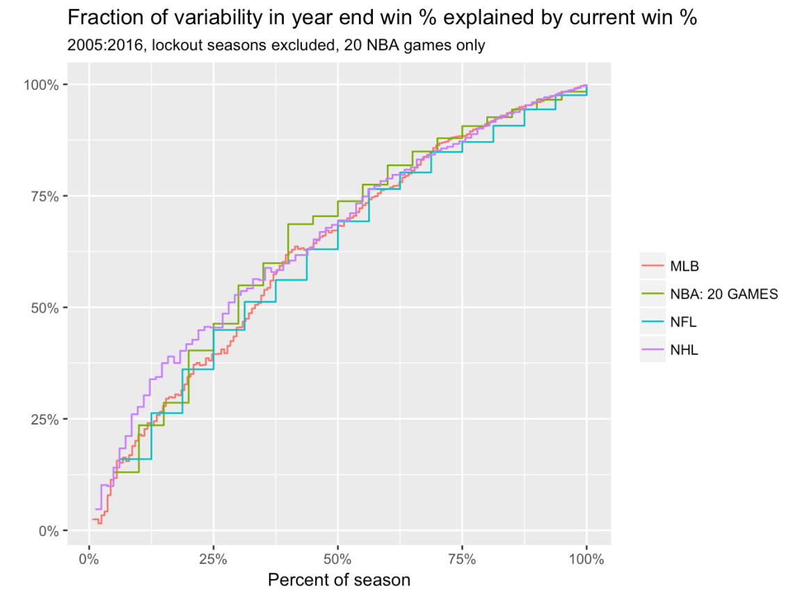
Using samples of 20 games, the R-squared path over the course of the season in the NBA roughly matched those from the other three leagues. In other words, the NBA could lose over three-fourths of its season and it still wouldn’t have a relatively shorter season than the other three leagues.
**********************
A few postscripts worth mentioning:
-These were easy curves to make, so much so that I worry someone has already made them. If that’s the case, please forward so I can cite appropriately.
-Given that won-loss percentages in the NBA would shrink towards 0.500 the more and more teams rest star players, the method above could actually underestimate how much the NBA stands out.
-If I had more time, I’d bootstrap for standard errors. Welcome to the end of a semester of teaching.
-This is but a brief tangent from a longer project that I am working on with Ben and Greg. Stay tuned for more – and hopefully better – ways of making these types of comparisons.
**********************
Footnotes:
*See work from Rodney Fort, David Berri, and Brad Humphreys, among others. I also liked this paper from Julian Wolfson and Joe Koopmeiners, which looks at similar issues using more complex models.
**There are several reasons that win-loss percentage is flawed, but it’s the simplest metric for purposes of a blog post. Among other reasons, won-loss percentage is impacted by unbalanced schedules (like playing in an easy division or a tough division) and which teams you end up playing at home. Thus, outside forces can impact won-loss percentage and skew our findings in unknown directions.
***R-squared’s not great, either. It can be unduly impacted by one or two observations, for example. However, given that the fit between current win percentage and end-of-year win percentage is likely fairly linear, I’m hopeful that this issue is not a problem. One alternative approach would use won-loss percentage in a predictive model (e.g., predict the team with the higher win percentage would win). Perhaps for another day.

1 Comment