
Greg’s artwork inspired me to do something.
I’m not sure if this is art, because if that’s the case, then that may make me an artist.
But here it is.
Can you guess what the dots are for? Hint – it’s from the NFL, and I think its going to change.
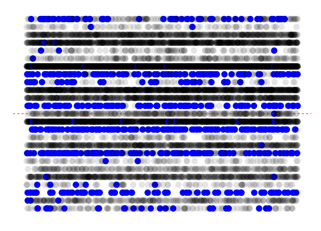
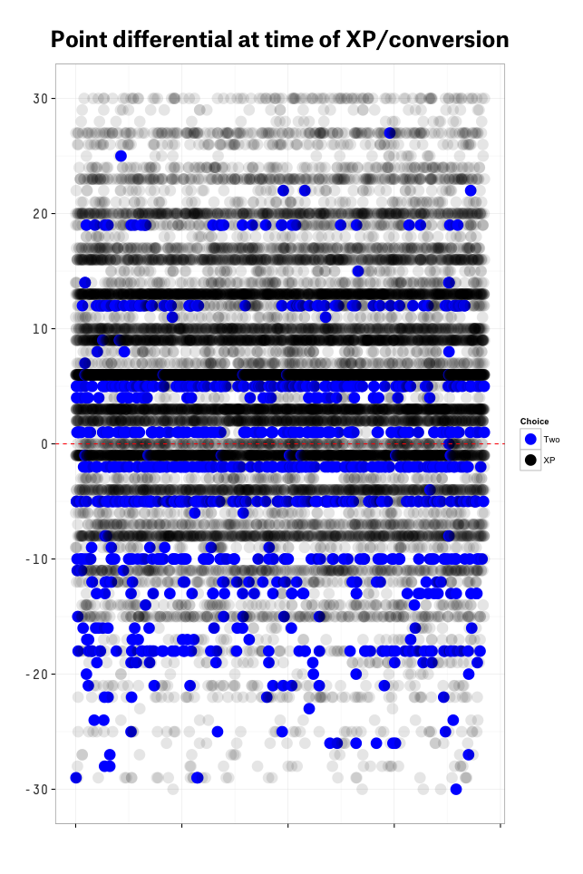
The x-axis in the chart above is an index, from 1 to 19,255. This represents the number of touchdowns since 2000. The y-axis represents is point differential for the team on offense (from down 12 to up 12). The light dotted red line in the middle intercepts the y-axis at 0. Finally, the dot depicts if the team went for two (blue is yes, light grey is no).
It’s pretty evident that teams almost always go for two in only a few situations. This isn’t a surprise. However, I’m curious how it will look after the 2015 season, given the recent rule changes. My guess is that we’ll see some changes in a few spots, with teams occasionally being more aggressive.
I also think its interesting how consistent the strategy has been over time.
For those of you who like axes, here’s the same plot.

And we expand the y-axis here:

I’m going to do a data art show next summer and I expect you to submit a piece.