
Over the years, there have been several ‘draft curves’ put together in each of the four major North American sports. These charts provide intuitive visualizations of the relative value of each pick, while allowing us to better understand prospect potential and evaluate trades.
Despite the growing popularity of drafts in each sport, I was disappointed to find that there are apparently
- No open-source guideline for how to make a draft curve and/or value chart
- No attempt at comparing each of the sports’ draft curves simultaneously.
Those will be my goals here.
To start, I’ll explore how to estimate a draft value curve within a single sport. Then, I’ll compare curves between the NFL, NHL, NBA, and MLB using a pair of figures.
How to make a draft curve
The association between draft pick (x-axis) and player performance (y-axis) is generally non-linear, featuring a steep drop-off between the first few picks and a more steady decline thereafter. This is because the gap in talent between players chosen at picks 1 and 10 is, in expectation, larger than the gap between picks 50 and 60.
Thus, draft curves are most appropriately estimated using a non-linear fit. As examples, here are curves constructed using an exponential decay model, a logarithmic decay curve, locally weighted scatterplot smoothing (loess), and monotonic regression. However, like any fitting process, there is no right answer as far as which curve is most appropriate. While it’s beyond the scope of this report, an interesting project would compare different draft curves on some out-of-sample drafts to identify which type most accurately predicts average player performance. That’s a doable and important task.
The technique adopted here uses that of loess smoothing, which fits low degree polynomial functions between small subsets of the data, across all of the data. Loess is attractive as far as estimating draft curves for a few reasons. First, we don’t have to specify any specific functional form between pick number and player output. This is a big benefit, as instead of guessing what the association between our variables is, we’ll let the data tell us. Related, a loess method is more simple and flexible than a deterministic approach. As for downsides, the most obvious one is that we won’t be left with a simple equation with which to estimate player performance given a draft position. However, the estimated value of each pick, as well as a measure of uncertainty, can easily be extracted using software.
In fitting a loess smoother, the input most often controlled manually is the smoothing parameter, generally expressed as alpha, which accounts for the fraction of nearby points used in fitting the curve. Non-technically, alpha refers to the jigginess of each curve; values near 0 allow for a jagged trend, while values near 1 reflect more smoothness. I settled on an alpha of 0.4, which allows for the identification of some rougher edges, while hopefully rounding off others that are mostly due to random fluctuations.
Show me some charts
Once you have the data, estimating draft curves using a loess smoother within a single sport is doable in a few lines of code.
I started by using the pro-reference sites to scrape draft position and player performance measures in each of the four major sports. While not perfect, I settled on a player’s career wins above replacement (MLB), win shares (NBA), approximate value (NFL), and games played (NHL) as my outcome measures. In the case of the NHL, it may seem strange to use games played as a metric of player success. However, there’s a precedent for using this outcome – Michael Schuckers suggests doing so here. In any case, if you want to try your own outcomes, or change anything you see below, the code for the entire analysis is posted on my Github page.
Here’s a draft curve for NHL drafts between 1990 and 2005, using the first 100 picks and a loess smoother. The area in grey reflects our uncertainty above and below the curve at each pick number, and each dot represents a single player.
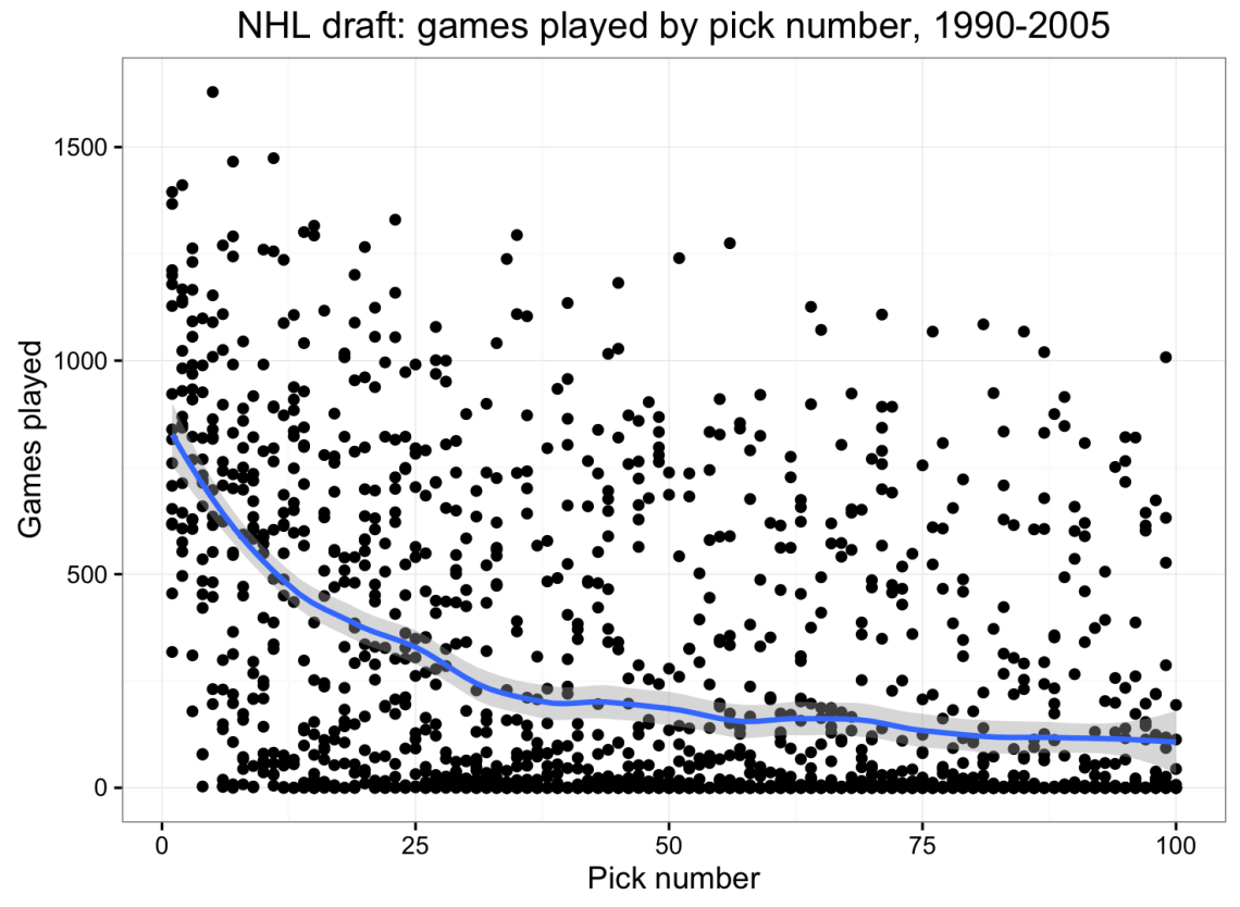
As far as games played, the average top pick is somewhere around 850, which is about three times the value of players picked late in the first round, and about six times the value of players chosen around pick 60. By and large, these numbers and this curve pass the smell test. So it’s a good start.
In addition, the NHL curve shows a nice feature of a loess fit which less flexible approaches would not have picked up on: right around pick 30, there’s a significant drop-off in games played. This dip could mean a few things. First, teams could be more willing to play their Rd. 1 picks on behalf of the sunk costs already invested in those players. Second, other teams could more frequently sign Rd. 1 free agents a few years down the road because of their prior label. Finally, and as a less provocative claim, because Rd. 1 picks are generally the top player chosen by their team, they’ll usually have an easier path to making their initial team’s rosters. While the player chosen 31st (Rd. 2) may have to outperform the player chosen 1st to make a roster, that’s usually not the case for the player chosen 30th.
Comparing across sports
While sport-level curves are interesting, I was also curious how each league has compared to one another.
There’s no easy way to answer to this question, however. In addition to disparities in the distribution and units of our outcome measures, there are also differences in the number of rounds in each sport’s draft (the NBA currently has 2, the NHL and NFL each have 7, and the MLB has 40).
One simple mechanism for making cross-sport comparisons is to only look at the top-60 picks, as this reflects the number of selections made in most NBA drafts. That handles our x-axis. To better understand the y-axis, I averaged the outcomes of players chosen between the 55th and 60th picks, using this number as a baseline. In the example above, we expect the top-pick in the NHL to be worth about 6 times that of the 60th pick.
Here’s a chart comparing the relative curves in each of the four sports, when divided by the average value of picks 55-60.
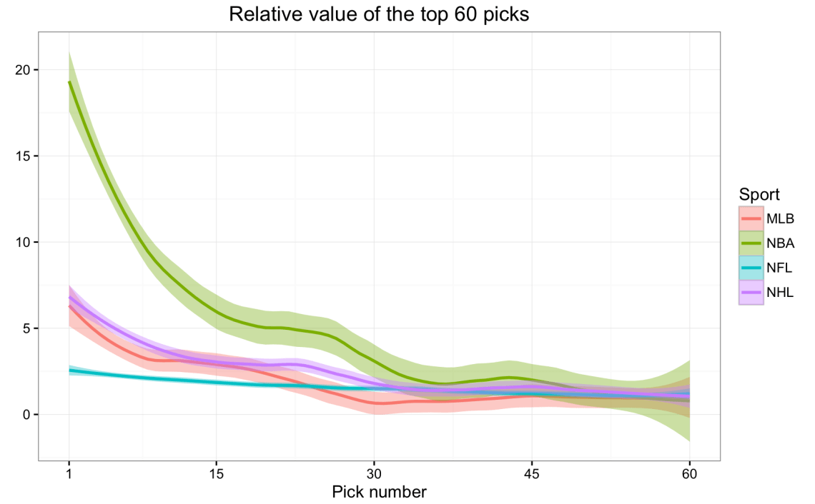
The top pick in the NBA draft is worth about 20x that of late second round picks, at least based on average win shares. Meanwhile, curves for MLB and the NHL are relatively similar. Finally, the most consistent pick-to-pick value appears in the NFL, where top picks are only worth roughly twice that of late round 2 picks, on average.
While the results of the NBA mostly matched expectations, the lack of any strong shape in the NFL curve, relative to the other sports, stands out. For example, it’s surprising that the MLB, which is evaluating high school players who are, by and large, a few years away from playing professionally, has a more significant drop-off in player talent at the top of the draft than is found in the NFL.
But don’t drafts have different numbers of rounds?
To account for the differing draft lengths (in rounds), we can tweak our curves so that the x-axis reflects the percentage of picks that were made up through each selection in each year, as opposed to a specific pick number. For example, the 50th percentile reflects the end of the NBA’s round 1, and roughly the middle of the 4th round in each of the NHL and the NFL. The MLB is excluded – at 40 rounds and with multiple minor league feeder teams, it is unclear that Rd. 40 of an MLB draft should be compared to, for example, Rd. 7 of an NFL or NHL draft.
In any case, here are draft curves across all rounds in the NBA, NFL, and NHL.

As in earlier, the NBA features the sharpest drop-off, while the NHL follows close behind. There’s a steeper decline in the NFL when looking across all rounds, with players chosen first overall, on average, worth about 10 times that of players chosen at the end of the draft.
Final assorted comments:
-It’s fair to use these curves to extrapolate to tanking incentives provided by each league. In the current system, it makes lots of sense to tank in the NBA, slightly less so in the NHL, and not as much sense in the NFL, as judged by the drop-offs in player talent.
-Pretty impressive job done by MLB scouting departments to accurately peg athletes who are three to four years away from playing professionally, and who stem from both top-level college programs and faraway high schools. Moreover, note that the MLB curve would appear even steeper if we could account for past issues with respect to league-level financial disparities. For a long period of time, more talented players were passed over by teams who could not afford them.
-Some technical notes: Our formal cutoff in the NHL was 210 picks – at one point it was higher, but I wanted this number to be consistent over time. Our NFL cutoff was 224 picks – at one point that number was higher, too. The NBA has used 2 rounds since 1989, so same cutoff throughout.
-One surprising factor to account for was a subtlety embedded in MLB draft history – players can be drafted more than once. This required setting initial player-level outcomes to 0 if that player was eventually drafted again.
-I don’t love my outcome measures, but they were the easiest ones available. As one positive sign, Saurabh at the Nylon Calculus found similar ratios to the ones above while using more advanced outcome measures in basketball.
-Finally, one could argue that a more preferred outcome would look at a player’s peak performance, instead of his career worth. That could certainly be the case. You could also make curves with “Probability of drafting an all-pro/all-star” as your outcome to answer a slightly different question.

Very nice work. There are good theoretical reasons for using a population-based approach and looking at the extremely talented tail. Adjust for number of distinct body types required to play the sport. Formula comes out similar to a logarithm. Start here: https://www.researchgate.net/publication/263083522_ON_THE_VALUE_OF_AFL_PLAYER_DRAFT_PICKS or here: http://www.sloansportsconference.com/content/dequantizing-the-player-draft-using-extreme-value-theory/
Very cool, thanks for sharing. I’ll take a look!