
Noah and I had heard and read a bunch of discussion about the rise of small budget teams in baseball. When we set out to prove it, we actually found the opposite to be true. Here’s our article for 538, titled “Don’t be fooled by baseball’s small budget success stories.”
There were several interesting follow-up questions, as well as some anecdotes that didn’t quite fit in the article. I encourage to read Tango’s blog for interesting comments on my article, as well as general thoughts on salary and winning in baseball.
Anyways, I’ll answer a few of the questions here (comments in bold).
1 – Can you rank teams over 30 years by area between team regression line and mlb regression line (via @beerback)?
Sure.
Given that some franchises (Montreal, Tampa, Washington) have only played in a portion of the seasons we covered, I looked at the average yearly residual between each franchises win percentage and its expected win percentage, given its relative payroll. Here’s a barplot.

No surprises here. Relative to their payroll, the Cubs have been about 5 annual wins worse than expectation, with Oakland about 6 wins better. Montreal, St. Louis, and Atlanta all stand out as teams that have spent wisely over the last 30 years, on average. By and large, these results match our intuition.
Also, its worth pointing out that Montreal’s run in the 90’s nearly matches Oakland’s in the 2000’s as far a small-budget team spending wiser. In three of four seasons between 1993 and 1996, the Expos finished with a win percentage above 0.540 while spending less than $20 million. In relative salaries, that’d be equivalent to spending $42 million in 2015…which is about a third less than the Astros current payroll.
2- I don’t like the idea of creating a best-fit curve, if a best-fit line will do. And we can see for the overall 30-year league average, it IS practically a straight-line. That it doesn’t look like a straight line at the team level simply means “small sample size” (@tangotiger).
In our article, I used smoothed lines to express the relationship between winning and spending for each team. However, by and large, the plot for all teams together is nearly linear. Are the funky team-specific curves just due to chance?
As one way of considering this question, I calculated a residual for each team in each season, which represents the distance above or below the line of best fit for that year’s winning percentage. As an example, positive residuals represent teams that outperformed expectations.
Next, I used bootstrap resampling, taking each fitted value from the line-of-best-fit and adding random noise, where the error was sampled (with replacement) from the observed set of residuals. This gives a set of imputed winning percentages, representing a sample of seasons that could have occurred if there was simply noise above or below a straight line.
We can compare the imputed curves to the observed ones to answer a few questions. First, are there as many curved lines when we bootstrap? If so, the curved relationships that we observed are likely explained by chance. Another question – are there as many teams that are consistently above or below their payroll expectation?
Here’s the first simulation. Click for a second iteration, if you are interested.
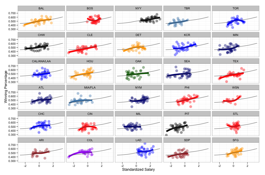
As a reminder, here’s what we are comparing to – the observed curves. And as an example, this is the set NL East curves. The x-axis is standardized salary, and the y-axis is win percentage.

Few, if any, of the smoothed curves that were simulated using an underlying linear association were able to match either the (i) impressive performance (relative to salary) of the Braves or (ii) the Mets’ bizarre u-shape.
This exercise tends to support a few conclusions.
First, results like those of the Braves and the A’s, which, on average, outperformed their expectations, were likely not due to chance. None of the simulated curves were consistently above or below the line the Atlanta’s and Oakland’s curves were.
Second, while most teams can be fit using a straight line, the relationship may not have been linear for all teams. No franchises in the simulated iteration seems to match the Mets’ u-shape (or a few similar ones from other teams).
3- How strong did you find the correlation to be? It seemed like most points were clustered along the wins (y) axis and not necessarily following the average curve.
The average yearly correlation between winning percentage and standardized salary has been between 0.30 and 0.65 during each season between 1993 and 2014. In all but four seasons, the correlation is significantly different from 0.
Also, it’s worth pointing out that Tango used a similar strategy and aggregated salary and win percentage across a decade’s worth of seasons. He found that the correlation between winning and a salary index to be about 0.70, using the seasons 2002-2011.
